> ## Documentation Index
> Fetch the complete documentation index at: https://www.dynamic.xyz/docs/llms.txt
> Use this file to discover all available pages before exploring further.
# Customizing Terms of Service (ToS) & Privacy Policy (All Wallets)
For new React apps, we recommend the JavaScript SDK with React Hooks (`@dynamic-labs-sdk/react-hooks`) instead of the legacy React SDK documented here. The JS SDK comes with many benefits such as a much smaller bundle size and other optimizations. Use the [React quickstart (JavaScript SDK)](/docs/javascript/reference/react-quickstart) to get started.
## Overview
Displaying your Terms of Service and Privacy Policy is an important step in customer onboarding. We give you the flexibility to display these documents in our SDK, or you can hide the links and display them elsewhere on your site.
 ## Configure policy URLs
### privacyPolicyUrl (optional) & termsOfServiceUrl (optional)
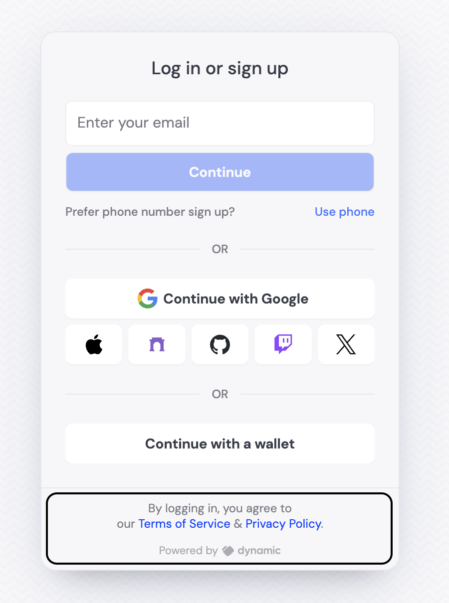
We currently display the Terms of Service and Privacy Policy during the connecting step of the SDK.
If you want to update the links, you can do so by updating the props in settings:
```TypeScript theme={"system"}
{children}
```
### Hiding the Terms of Service and Privacy Policy copy
If you don't want to display this text, you can hide the sentence with:
```TypeScript theme={"system"}
{children}
```
## Custom inline policy content
For even more flexibility, you can provide custom content for your Terms of Service and Privacy Policy directly inline using the `customPrivacyPolicy` and `customTermsOfService` props. This allows you to embed the full policy content within your app instead of linking to external pages.
```TypeScript theme={"system"}
## Configure policy URLs
### privacyPolicyUrl (optional) & termsOfServiceUrl (optional)
We currently display the Terms of Service and Privacy Policy during the connecting step of the SDK.
If you want to update the links, you can do so by updating the props in settings:
```TypeScript theme={"system"}
{children}
```
### Hiding the Terms of Service and Privacy Policy copy
If you don't want to display this text, you can hide the sentence with:
```TypeScript theme={"system"}
{children}
```
## Custom inline policy content
For even more flexibility, you can provide custom content for your Terms of Service and Privacy Policy directly inline using the `customPrivacyPolicy` and `customTermsOfService` props. This allows you to embed the full policy content within your app instead of linking to external pages.
```TypeScript theme={"system"}
Custom Privacy Policy
Your custom privacy policy content goes here.
),
customTermsOfService: (
<>
Custom Terms of Service
Your custom terms of service content goes here.
),
// ...other settings
}}
>
{children}
```
## Display as a checkbox
As an alternative to displaying the Terms of Service and Privacy Policy as a sentence, you can display a checkbox that the user must check to proceed.
To enable this feature:
1. Go to your Dynamic dashboard
2. Navigate to the login methods section under information capture
3. Turn on "TOS and Privacy Policy"
Once enabled, Dynamic will automatically display a built-in checkbox during the user's onboarding flow (post-login). The user must check this box to proceed.